SaaS pricing page
last updated: Sep 7, 2025
TL;DR
A SaaS pricing page should qualify, not confuse. Lead with one hero plan, show from $X, add a seats or usage toggle, and place three proof cues near the CTA.
How to:
How to:
- Pick one hero plan and label it plainly.
- Put from $X and a seats or usage toggle above the fold.
- Add three proof cues near the hero plan.
Glossary
- Hero plan: the single plan you want most buyers to pick.
- From $X: minimum monthly price shown without add-ons.
- Plan matrix: table comparing plans and features.
- Proof cue: logo, rating, testimonial, numbers, or certification.
- Seats: per-user pricing with volume tiers.
- Usage: metered units such as credits or API calls.
- Post-click message: short note after a click that sets expectations.
- Anchor link: link that scrolls to a deeper section.
- WTP: willingness to pay from research.
How to design high-converting SaaS pricing page
- Choose one hero plan. Your market likely has a most common use case. Promote the plan that matches it. Label it clearly. If your positioning is fuzzy, sharpen it with the value proposition guide.
- State from $X above the fold. Buyers need a ballpark number. Place from $X near the primary CTA. Add a short explainer on what affects the final price.
- Add a seats or usage toggle. Let buyers simulate cost with seats or units. Default to the model that matches how value scales for your product.
- Place three proof cues near the hero plan. Show 3 to 6 customer logos, a one-line testimonial with role, and a short safety net like 14-day trial or cancel anytime.
- Keep the plan matrix simple. Show 3 plans. Keep rows short and scannable. Put clear inclusions, then important limits. Use this landing page teardown checklist to trim bloat and jargon.
- Write FAQs that answer objections. Use real sales questions. Place the top 5 under the plans. Prepare answers to procurement with the founder demo script.
- Test order and microcopy. A/B test plan order, default toggle state, button labels, and FAQ order before testing colors. Keep a clean control.
Mid-article CTA: In 90 seconds, find the bottleneck blocking conversions on your pricing page. Take the free quiz and get a prioritized fix list.
Benchmarks
Treat these as directional. Use them to set a starting point before your tests.
What this means. Three plans plus a clear hero keeps scanning fast. Put from $X high. Keep the plan matrix short and consistent. Use badges and annual toggles with intent. This is pricing page best practices, not dogma.
Sample math.
If pricing page conversion rises from 2.0% to 2.6% after simplifying the matrix and adding from $X, that is a 30% lift. With 10,000 monthly visits and $49 ARPA (average revenue per account), that is 60 extra customers and roughly $2,940 more MRR.
If pricing page conversion rises from 2.0% to 2.6% after simplifying the matrix and adding from $X, that is a 30% lift. With 10,000 monthly visits and $49 ARPA (average revenue per account), that is 60 extra customers and roughly $2,940 more MRR.
In 90 seconds, find the bottleneck stopping your first 10 customers. Take the free quiz and get a personalized action plan.
Seats vs usage pricing
- Seats: simple modeling, easy forecasting, strong expansion in land-and-expand teams. Risk: perceived waste for low-usage roles.
- Usage: fair value perception, aligns price with outcomes, strong with APIs and data volume. Risk: bill shock, needs a cap or estimator.
Decision rule: If value scales with active users, pick seats with volume tiers. If value scales with transactions or credits, pick usage. Add a toggle to estimate both when possible. This is the core choice on a SaaS pricing page.
Templates
Use this SaaS pricing page template. Edit numbers. Keep structure.
Hero block
Plan labels
Plan matrix rows
Proof cues strip
Objection-crushing FAQs under cards
Anchors and microcopy
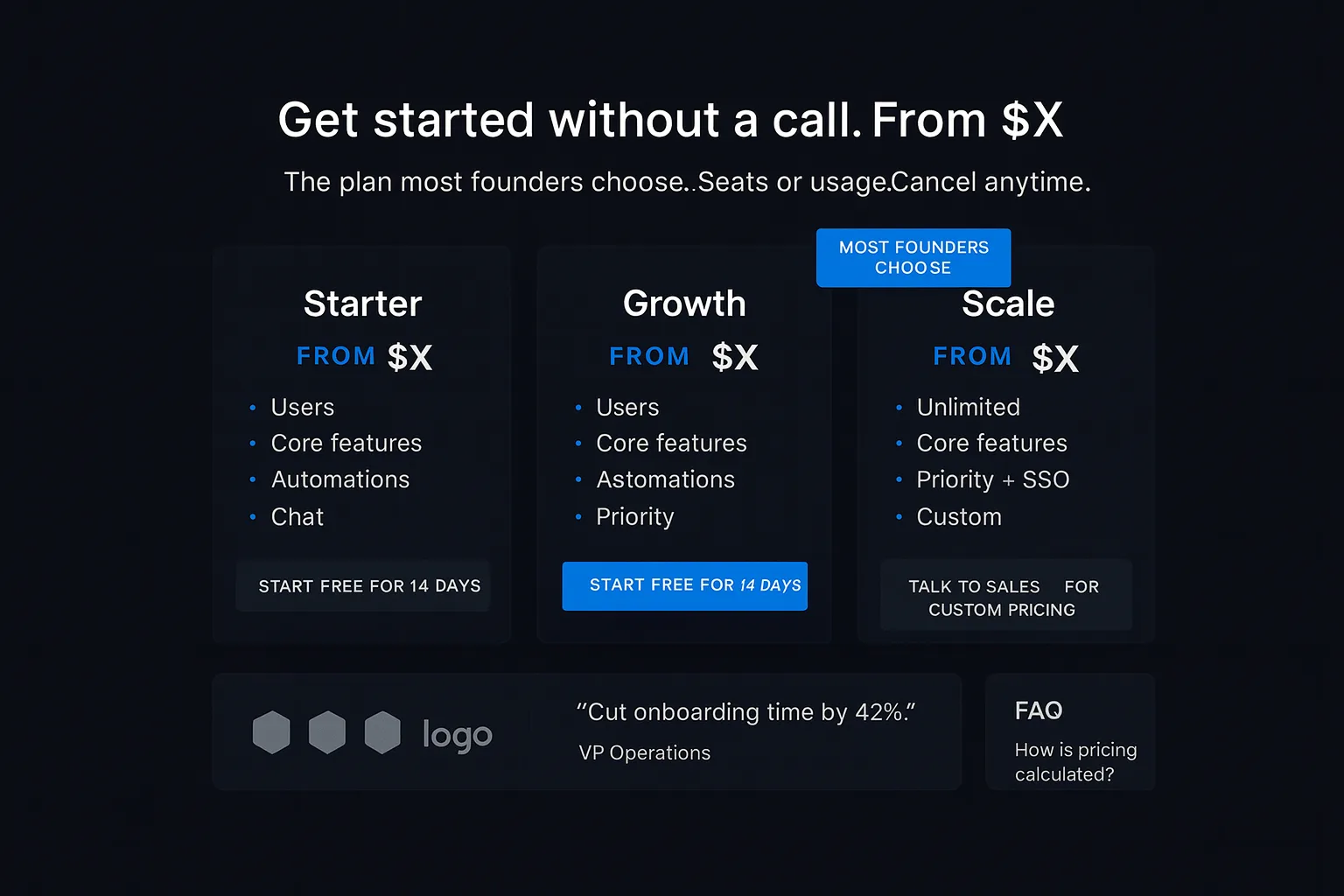
Hero block
- Headline: Get started without a call. From $X per month.
- Subhead: The plan most founders choose. Seats or usage. Cancel anytime.
- Buttons: Start free for 14 days. Talk to sales for custom pricing.
Plan labels
- Starter. Growth. Scale.
Plan matrix rows
- Users included: 5, 25, Unlimited
- Core features: Yes, Yes, Yes
- Automations: -, Yes, Yes
- Support: Chat, Priority, Priority + SSO
- Usage included: 10k credits, 100k credits, Custom
- Overages billed at a clear rate, e.g., $0.90 per 1k credits
Proof cues strip
- Logos: add 3 to 6 logos your ICP knows.
- One-line testimonial: “Cut onboarding time by 42%.” VP Operations
- Safety net: 14-day free trial. No credit card.
Objection-crushing FAQs under cards
- How is pricing calculated?
- Can I change plans anytime?
- What happens if I exceed usage?
- Do you offer annual billing?
- Do you support procurement?
Anchors and microcopy
- Compare plans → #plans
- See FAQs → #faq
- Talk to sales → #contact
- Post-click message: You can invite teammates next. Billing happens after trial.
Risks
- Too many plans. Cap at three visible. Hide add-ons behind details.
- Cute names that hide value. Use plain labels buyers understand.
- Hiding price. Show from $X and an estimator.
- Badge overload. One badge per hero plan.
- Unlimited without limits. Define fair use or caps.
- Dark patterns in compare tables. Keep consistent rows and plain text.
FAQ
- You:Should I show prices if I also sell enterprise?Guide:Yes. Show from $X and a custom tier for large buyers.
- You:Is from $X better than exact prices?Guide:Use from $X when add-ons can change totals. Keep the estimator close.
- You:Seats or usage by default?Guide:Default to how your value scales today. Offer a toggle for the rest.
- You:Where do I place the full FAQ?Guide:Put the top 5 under the cards. Link to the full FAQ below.
- You:Do I need a trial?Guide:If your product has short time-to-value, a trial is a strong safety net.
- You:Monthly or annual default?Guide:Default annual only if the ICP expects annual budgets. Show savings in plain text.
- You:Do “most popular” badges work?Guide:Used sparingly, yes. Keep it honest and close to the target plan.
- You:How do I handle currencies?Guide:Detect currency by location, let users switch, and round cleanly.
Ready to stop guessing?
© 2025
If you're a funded founder who needs a pricing page that qualifies buyers fast,
Find where your first 100 customers are in 2 mins. — or browse all the free founder guides.