SaaS pricing page examples (2025)
last updated: Mar 31, 2026
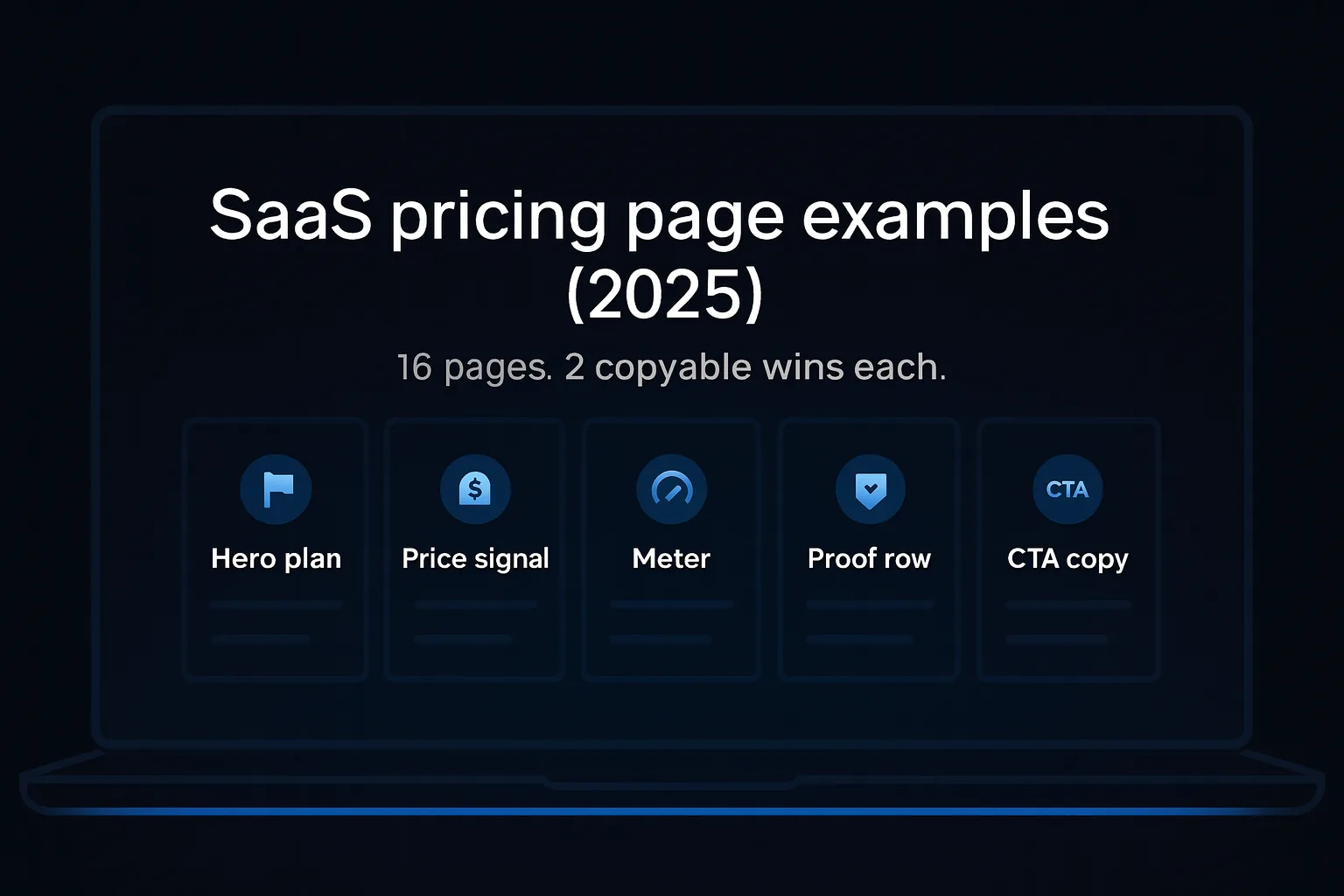
TL;DR
Use this gallery of saas pricing page examples to copy patterns that convert. Start with a hero plan, one price signal, and a proof row near the first CTA.
How to
How to
- Pick a hero plan.
- State one meter clearly.
- Add a proof row and repeat the CTA.
Glossary
Hero plan: the default plan you steer most buyers to.
Price signal: the number you emphasize first (seat, events, fee).
Meter: what usage you bill on (seats, events, compute).
Proof row: logos, quotes, or badges placed near the first CTA.
Calculator: an estimator that shows cost at different usage.
Merchant of record (MoR): provider that handles tax, fraud, payouts.
How to craft high-converting pricing page for B2B SaaS
- Pick a hero plan. Most buyers need a default. Name who it’s for and why. If your messaging is fuzzy, tighten it with my value proposition for startups guide.
- Choose one price signal. Seat price, event price, or headline fee. Do not hide the meter.
- Add a proof row above the fold. Logos, short quotes, compliance badges. If the hero feels weak, borrow patterns from the SaaS landing page examples gallery.
- Spell out the meter in a sentence. “You’ll pay $X per seat plus $Y per 1k events.”
- Place a calculator near the meter. Show breakpoints and totals. Label the per-unit rate.
- Collapse complexity. Keep one default toggle. Move depth to tables and drawers.
- Write the post-click message. After “Get started,” confirm billing rules and caps.
Usage-based vs seat-based pricing
When seats win. Team tools, simple headcount mapping, finance-friendly.
When usage wins. Infra and analytics where value scales with events or compute.
Decision rule. Lead with the meter that best predicts value for your buyer. With two meters, write one sentence up top and include a live estimator. Early-stage and unsure? Test a limited-time pilot using the playbook in Pilot pricing for seed-stage SaaS that converts to paid.
Benchmarks for saas pricing page examples
Patterns matrix (scan and copy).
16 B2B SaaS pricing page examples
Linear pricing
Vercel pricing
Supabase pricing
Retool pricing
PostHog pricing
Sentry pricing
Mixpanel pricing
Intercom pricing
Webflow pricing
Framer pricing
Cal.com pricing
Lemon Squeezy pricing
Paddle pricing
Render pricing
Railway pricing
Plausible plans
- You spot the right plan in seconds.
- The same “Get started” button everywhere keeps choices simple.
- Minimal pages can feel empty. Add three bullets so value is obvious.
Vercel pricing
- Clear plan names help non-technical buyers find their level.
- A helpful FAQ answers money questions before support does.
- Lots of details can drown the message. Collapse long sections.
Supabase pricing
- Limits are explained in plain words. New founders get it fast.
- A free start lowers the fear of trying.
- If you use credits, add a simple calculator for non-engineers.
Retool pricing
- “Per seat” is stated clearly so finance knows the cost.
- The feature list is skimmable. You can compare in one glance.
- If you add usage fees later, put them near the button.
PostHog pricing
- Prices per event are spelled out with an example.
- A built-in calculator shows the bill before you commit.
- Cap the monthly bill to reduce fear.
Sentry pricing
- Two plan tiers make the choice easy for teams.
- It explains how on-demand and reserved work in simple terms.
- Too many toggles confuse buyers. Pick one default.
Mixpanel pricing
- “1M events free” is an easy hook to remember.
- Social proof sits beside the button so trust lands early.
- Sliders need breakpoints and a per-thousand label.
Intercom pricing
- One line says the deal: seats plus AI resolutions.
- A tiny estimator shows your likely bill and calms nerves.
- With two meters, repeat that one-line explainer near every CTA.
Webflow pricing
- It tells you there are two paths and which to pick.
- Savings labels nudge annual only after value is clear.
- If your product has paths, add a short “Which do I need?” guide.
Framer pricing
- Two choices — Launch or Scale — are simple to decide.
- Editor pricing is visible so teams can budget.
- If editors cost extra, say it near the plan table.
Cal.com pricing
- Free for individuals makes adoption painless.
- A competitor table gives confidence without a sales call.
- Keep the comparison factual and include a “last updated” note.
Lemon Squeezy pricing
- One headline fee tells founders exactly how pay-as-you-go works.
- Benefits like tax and fraud are listed where you can see them.
- Call out edge cases like PayPal or international fees early.
Paddle pricing
- The same simple fee appears everywhere, so it sticks.
- Enterprise buyers see a clear path to talk to sales.
- If your orders are tiny, explain special pricing like Paddle does.
Render pricing
- It shows both plan prices and raw machine prices. No surprises.
- “Prorated to the second” calms worries about commitment.
- If you list many options, add a quick-start picker.
Railway pricing
- The main numbers — RAM and CPU — are right up front.
- A small monthly credit frames value for beginners.
- Show a “typical app costs” example.
Plausible plans
- Plans map to pageviews, which is easy to understand.
- The upgrade rule is clear, so billing is predictable.
- If you promise “no overages,” say exactly what happens at the limit.
Templates / examples
Write your one-liner with this value proposition template:
“For [segment] who need to [job], [product] delivers [outcome metric] in [timeframe], proven by [proof point].”
“For [segment] who need to [job], [product] delivers [outcome metric] in [timeframe], proven by [proof point].”
- B2B SaaS (RevOps): “For seed-stage SaaS founders who need 5 demos a week, RevPilot books them in 14 days, proven by 7 logos and a 19% reply rate.”
- Fintech: “For eCom CFOs who need faster payouts, FlowNow clears funds in 1 day, proven by audited settlement reports.”
- Health: “For clinic managers who need fewer no-shows, Attendix cuts no-shows by 28% in 30 days, proven by 3 RCTs.”
- Developer tooling: “For data teams who need stable pipelines, DeltaGuard halves incident time in 2 weeks, proven by PagerDuty logs.”
Button microcopy
- “Join the design partner list”
- “See pilot scope and pricing”
Expectation banner (post-click)
“You’re early. We’re inviting 5 design partners this quarter. Join the shortlist and the founder will reach out. If we don’t proceed, we’ll share a research recap.”
Optional tools
- CMS: Tilda to ship the page today.
- Analytics: Google Analytics 4 (GA4) + Google Tag Manager for events.
Risks
- Vague verbs. Fix: use specific jobs.
- Feature lists. Fix: one outcome, one proof.
- No metric. Fix: add time saved, revenue, or risk reduced.
- Unrealistic proof. Fix: audited numbers beat adjectives.
- Too many segments. Fix: ship per segment.
- Hidden price. Fix: set a floor to pre-qualify.
- Over-claiming. Fix: state ranges and pilots.
- Never tested statement. Fix: 30-minute LinkedIn and email test.
FAQ
- You:How many plans is too many?Guide:Three to five works for scanning. More is fine if grouped by role or use case.
- You:Should I show monthly and annual?Guide:Yes, but choose a default. Explain “Save X% annually” near the toggle.
- You:Where do calculators belong?Guide:Near the meter and again in Billing. Not hidden in docs.
- You:Do I need an enterprise card?Guide:If you sell through procurement or need SSO or SOC 2, yes. Make “Talk to sales” the clear path.
- You:How to phrase overages?Guide:State caps and defaults: pause at limit by default. Offer opt-in auto-scale.
- You:What if I have two meters?Guide:Write one sentence that explains both. Add an estimator. Repeat in the FAQ.
- You:What proof belongs on the page?Guide:Logos, one-liners, compliance badges, and a link to case studies.
- You:How deep should tables go?Guide:Deeper than cards. Collapse by default. Keep the first row about the meter.
Find where your first 100 customers are in 2 mins. — or browse all the free founder guides.