SaaS landing page examples
last updated: Sep 15, 2025
TL;DR
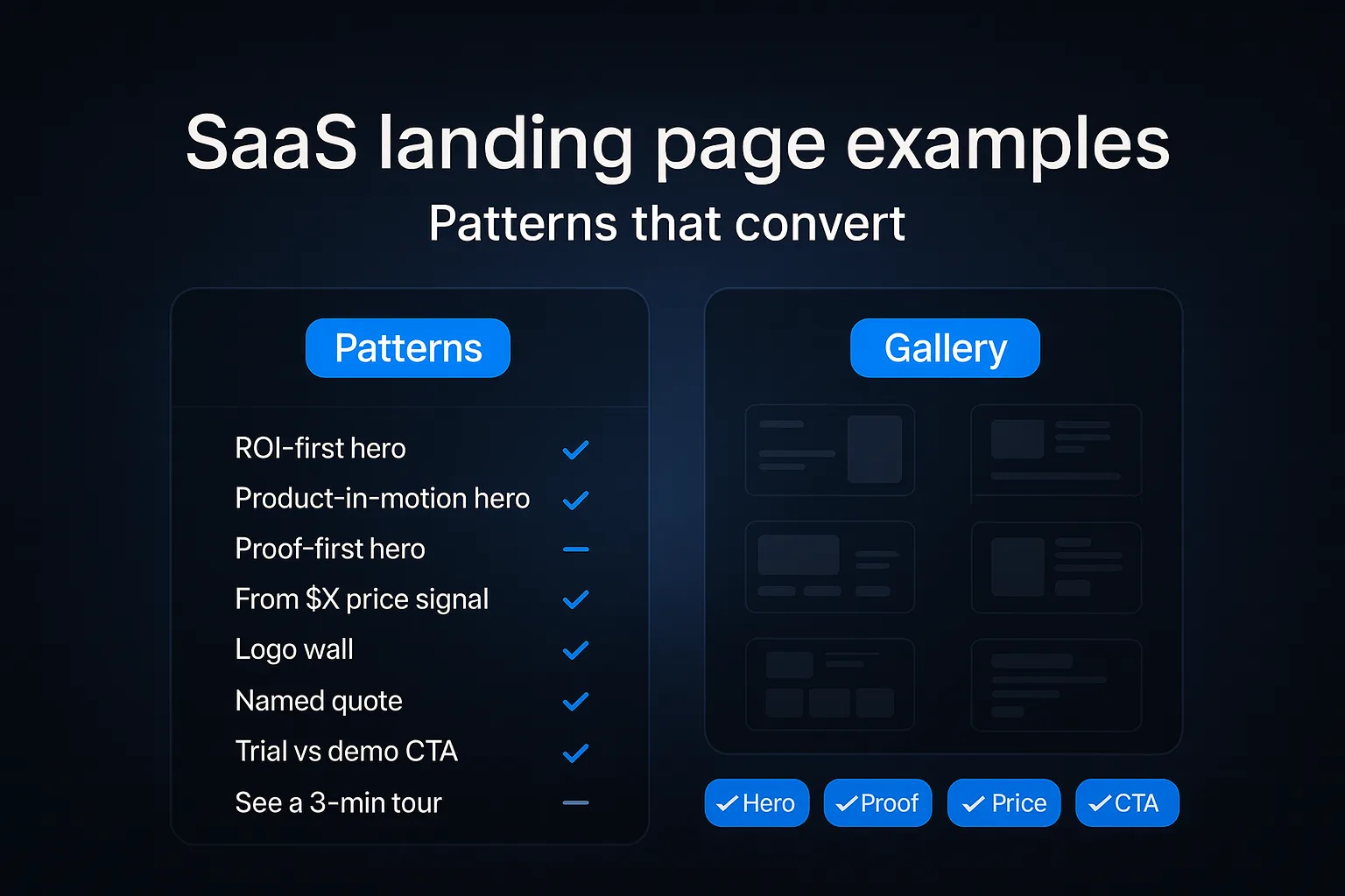
Great SaaS pages do four things fast: state the value proposition, show a proof row, set a friendly price signal, and use a clear CTA label. These saas landing page examples show eight repeatable patterns.
How to:
How to:
- Skim the patterns matrix.
- Pick one hero model that fits your product.
- Ship the smallest change that improves clarity this week.
Glossary
Value proposition: Short line that states the business value.
Proof row: Logos, metrics, quotes that earn trust.
Price signal: Gentle “From $X” to set expectations.
CTA label: The exact text on your main button.
Hero section: Top block with headline, media, CTA.
LCP: Largest Contentful Paint. Load metric. Keep ≤ 2.5s at p75.
Proof row: Logos, metrics, quotes that earn trust.
Price signal: Gentle “From $X” to set expectations.
CTA label: The exact text on your main button.
Hero section: Top block with headline, media, CTA.
LCP: Largest Contentful Paint. Load metric. Keep ≤ 2.5s at p75.
How to design high-converting landing page
- Pick your win. Decide the one action you want today. Trial signups or demo requests. Write it at the top of your doc.
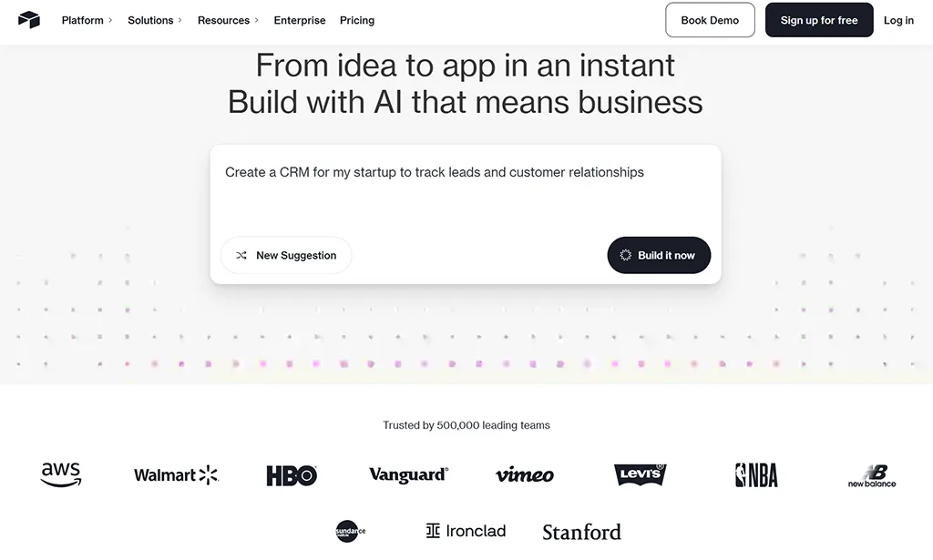
- Choose a hero model. From the matrix, pick ROI-first, product-in-motion, or proof-first. Match the pattern to your buyer’s doubt.
- Write the value line. 7–12 words. Say the outcome, not the features. Example: “Close deals 30% faster.”
- Add one proof row. Show 5–8 logos or a named quote. Place it near the headline so it gets seen.
- Set a price signal. If you’re self-serve, add “From $29/user” near the primary CTA. Enterprise can move price to the pricing page.
- Label the CTA by outcome. “Start free trial,” “Book a 15-min demo,” or “See a 3-min tour.” Kill “Learn more.”
- Protect speed. Compress hero media. Fix image dimensions. Aim LCP ≤ 2.5s at p75.
- Ship a micro-test. Change one thing. Measure a week. Keep the winner. Repeat.
Patterns matrix
Gallery: SaaS Landing Page examples
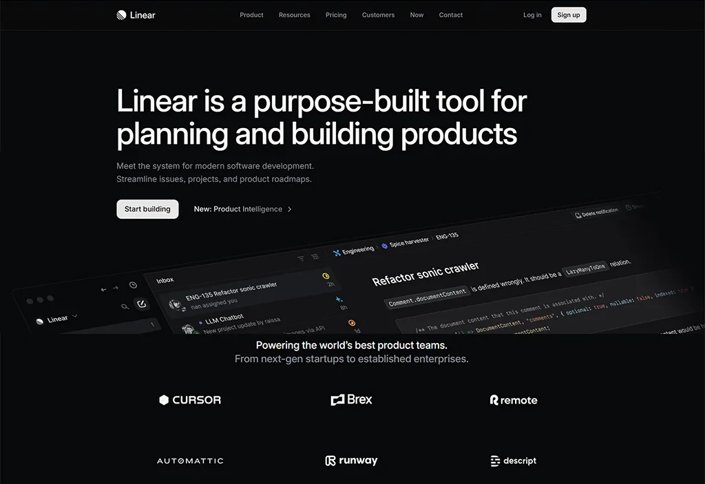
Linear — product management
- Ultra-clear value on speed; product-in-motion reduces effort.
- Outcome CTA (“Start free”) matches intent.
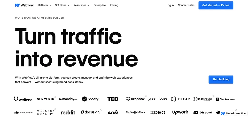
Webflow — website platform
- Product-in-motion hero shows the outcome instantly.
- Clear “Get started — it’s free” lowers friction.
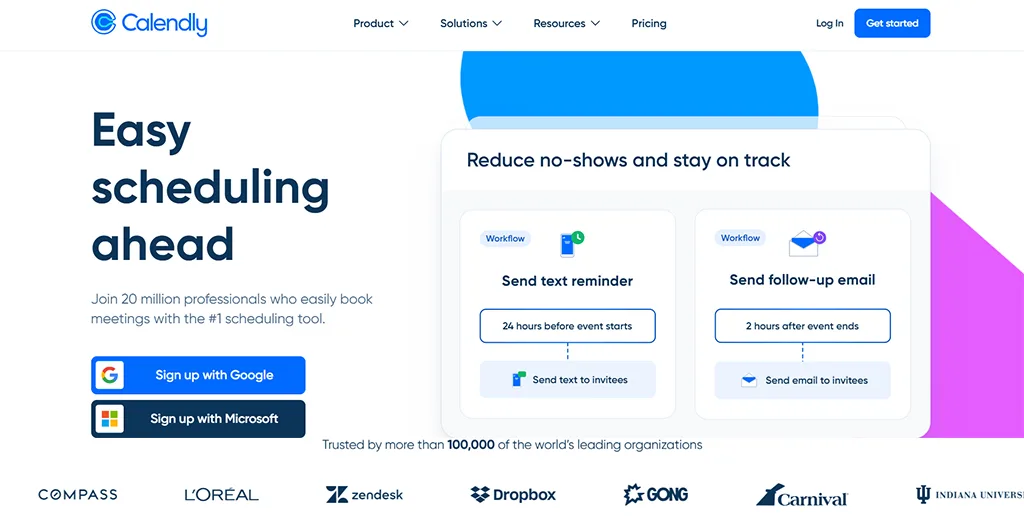
Calendly — scheduling
- Pain-first headline maps to the problem users feel.
- Frictionless “Sign up free” accelerates activation.
Airtable — apps on data
- Benefits-first promise with crisp subhead for who/what.
- Strong CTA placement with visual clarity in the hero.
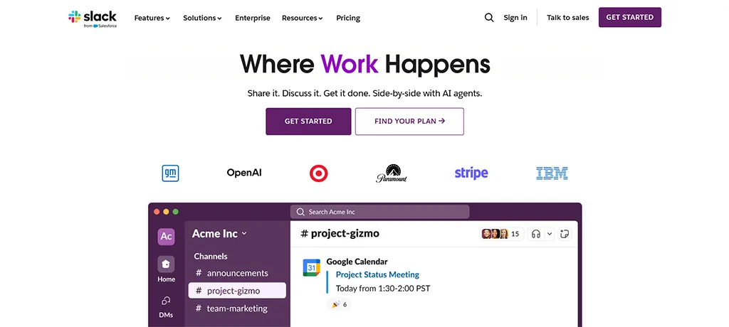
Slack — team communication
- Proof-first hero with recognizable logos builds trust fast.
- Simple “Try for free” directs action without overthinking.
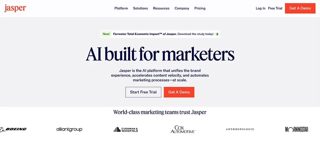
Jasper — AI for marketing
- Demo-first hero for evaluators who need proof.
- Secondary self-serve path keeps momentum for tinkerers.
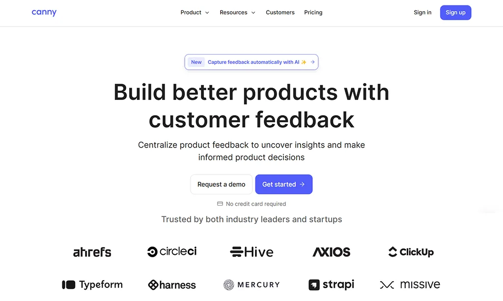
Canny — customer feedback
- “Start free” plus clear positioning removes hesitation.
- Social proof near the headline earns attention early.
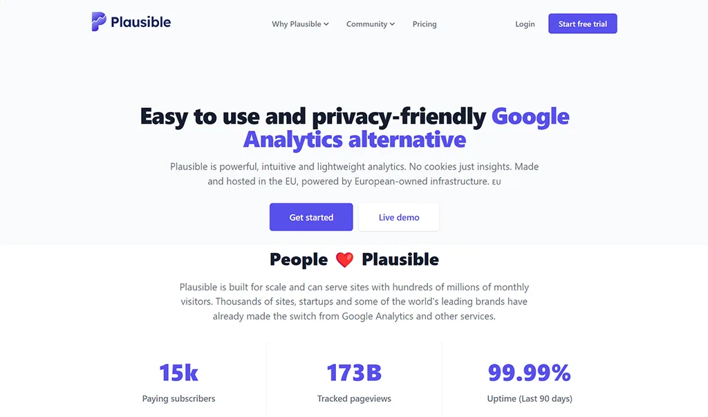
Plausible — privacy-first analytics
- Privacy value prop is explicit and memorable.
- Lightweight story + predictable pageview tiers signal fairness.
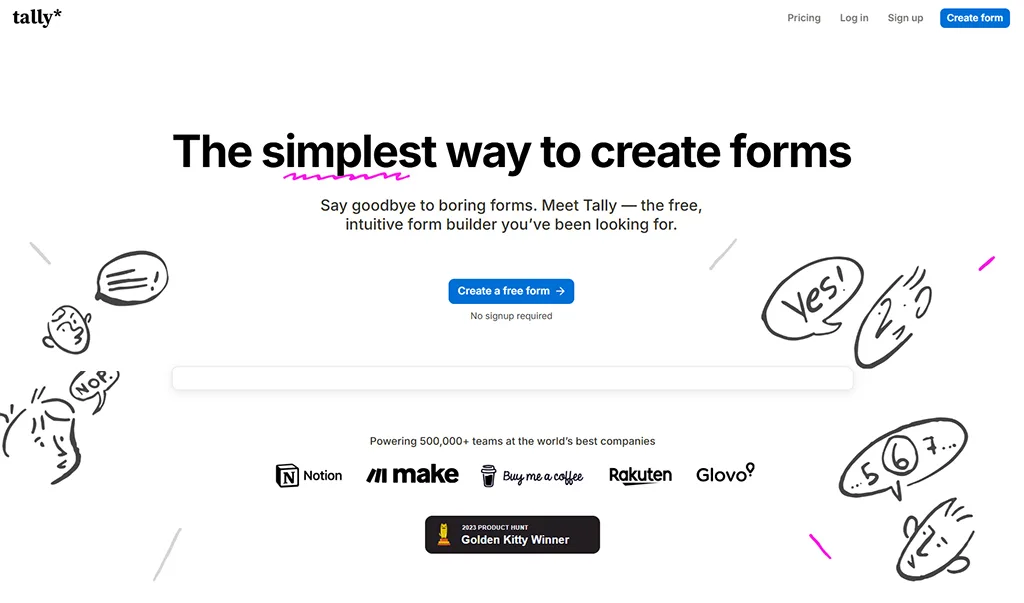
Tally — form builder
- Free-first message with generous limits creates urgency to try.
- Conversational copy makes the CTA feel safe.
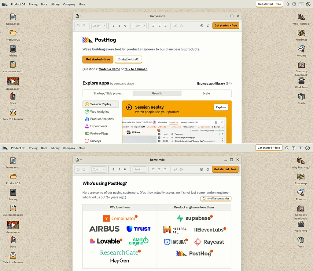
PostHog — product analytics for developers
- Dev-first narrative unifies analytics, flags, and replay.
- Primary CTA stays visible and unambiguous.
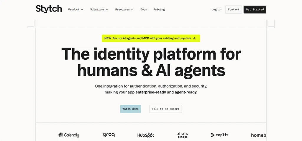
Stytch — authentication
- Outcome-focused headline with “Watch demo” for quick proof.
- Clear secondary path for sales-assisted buyers.
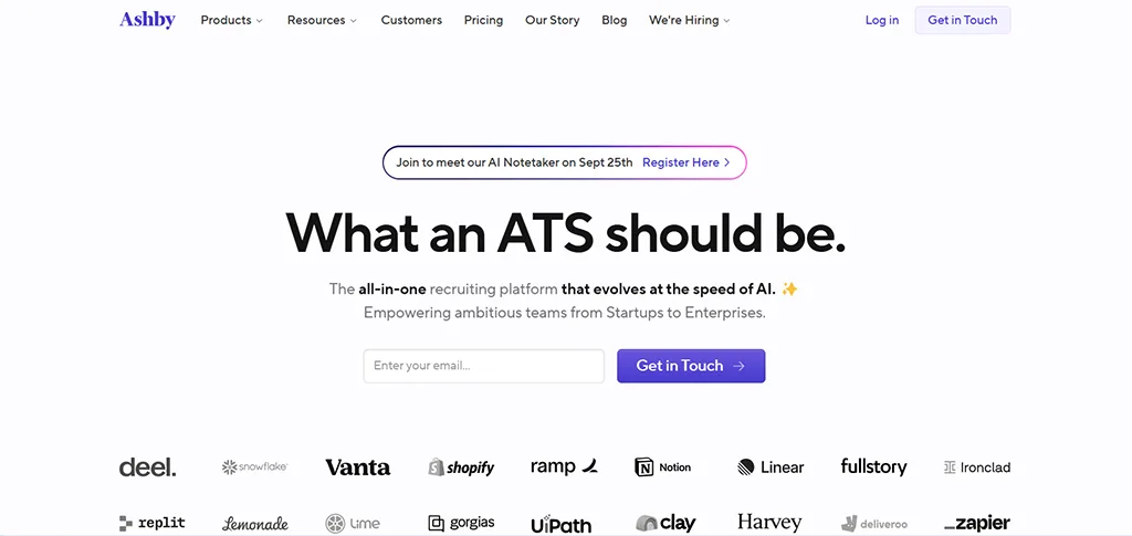
Ashby — recruiting platform
- Named quotes and known logos compress trust building.
- Demo-first CTA fits higher-ACV evaluation.
Landing Page Hero Builder (Free, Interactive Template)
Get the template now and save hours of work.
Get the template now and save hours of work.
Which activation model to use
Trial vs demo
- Trial: Fast time-to-value. More signups. Lower qualification.
- Demo: Fewer signups. Better qualification. Higher close rate.
- Rule of thumb: Default to trial. Keep “Book a demo” visible for complex or high-ACV sales.
Templates
Grab the blocks and wireframe from the landing page teardown checklist. For copy, use the value proposition for startups. Price-signal with help from the saas pricing page. If you use a demo CTA, adapt the founder demo script. Track tests through the ga4 + tag manager for founders.
Risks
- Bait pricing and hidden fees erode trust.
- Heavy hero media that pushes LCP above 2.5s.
- Vague CTA labels like “Learn more”.
- Proof wall clutter that hides the CTA.
- Secondary CTA hidden on mobile.
FAQ
- You:How long should the hero be?Guide:Two short lines. Value first. Detail second.
- You:What’s the right order: value, proof row, then CTA?Guide:Value, proof, CTA works for most B2B SaaS. If your brand is unknown, push proof earlier.
- You:Where do I put “From $X”?Guide:Near the primary CTA for self-serve. On the pricing page for enterprise.
- You:Trial or demo for early-stage?Guide:Default to trial unless ACV is high or onboarding is heavy.
- You:Do I show VAT or “ex VAT” for UK buyers?Guide:Yes. If you take UK payments, clarify “ex VAT” near price.
- You:What must be above the fold?Guide:Value line, primary CTA, and one trust element. Keep hero media light to protect LCP.
Ready to stop guessing?
© 2025
If you need to up a CR of your landing page,
Find where your first 100 customers are in 2 mins. — or browse all the free founder guides.